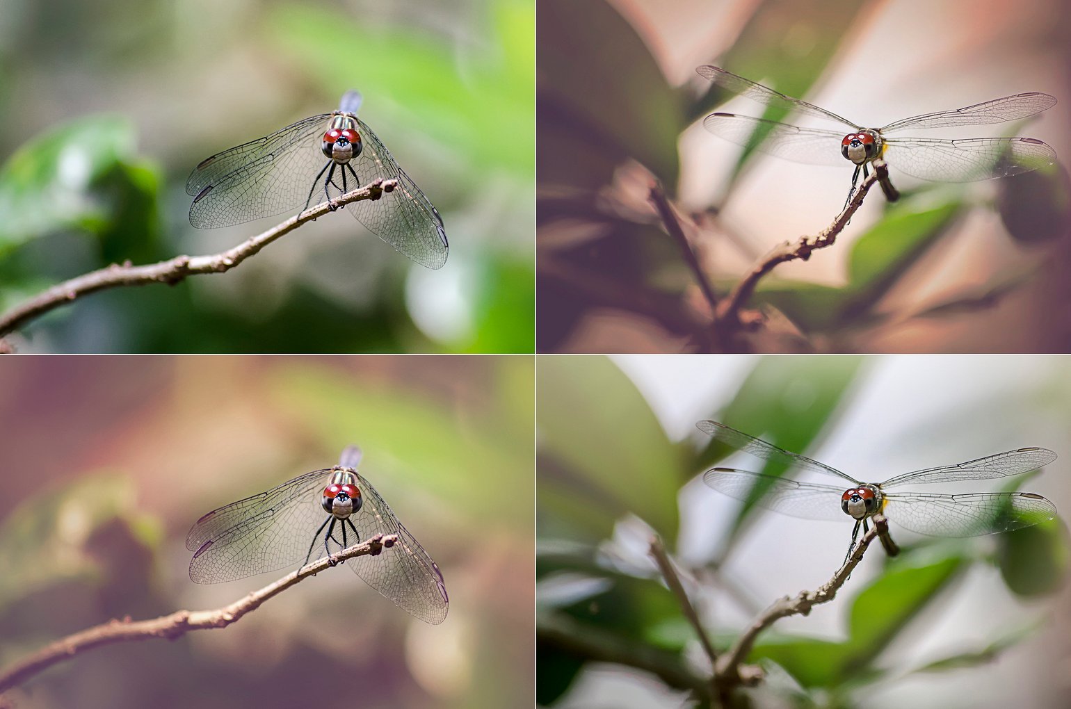
Day 10, April 6th, 2015
Jennifer Faye Thank you so much for the feedback! I was leaning towards those edits as well.
Eline I like all of them very much, but I think bottom right is my favourite :) The right side is indeed a better pose, but top right is just a little too dark for me. I think I like the editing of the bottom left picture the most :)
JudithO All great pictures! Right side is the better pose, for me it's hard to decide if I like the top or bottom one better. As Kevin pointed out the dragonfly stands out more on the top one but as Eline I like the brightness of the bottom one .... both are great ;)
Jennifer Faye Thanks everyone!
EXIF data
Brand
NIKON CORPORATION
Model
NIKON D5100
Aperture
ƒ/5.6
Focal length
200mm
Shutter speed
1/4000s
ISO
800


Kevin Drum Either bottom left or top right because the subject stands out the best (even if it looks less natural). The right side is a better pose, but the left side has a less distracting background.