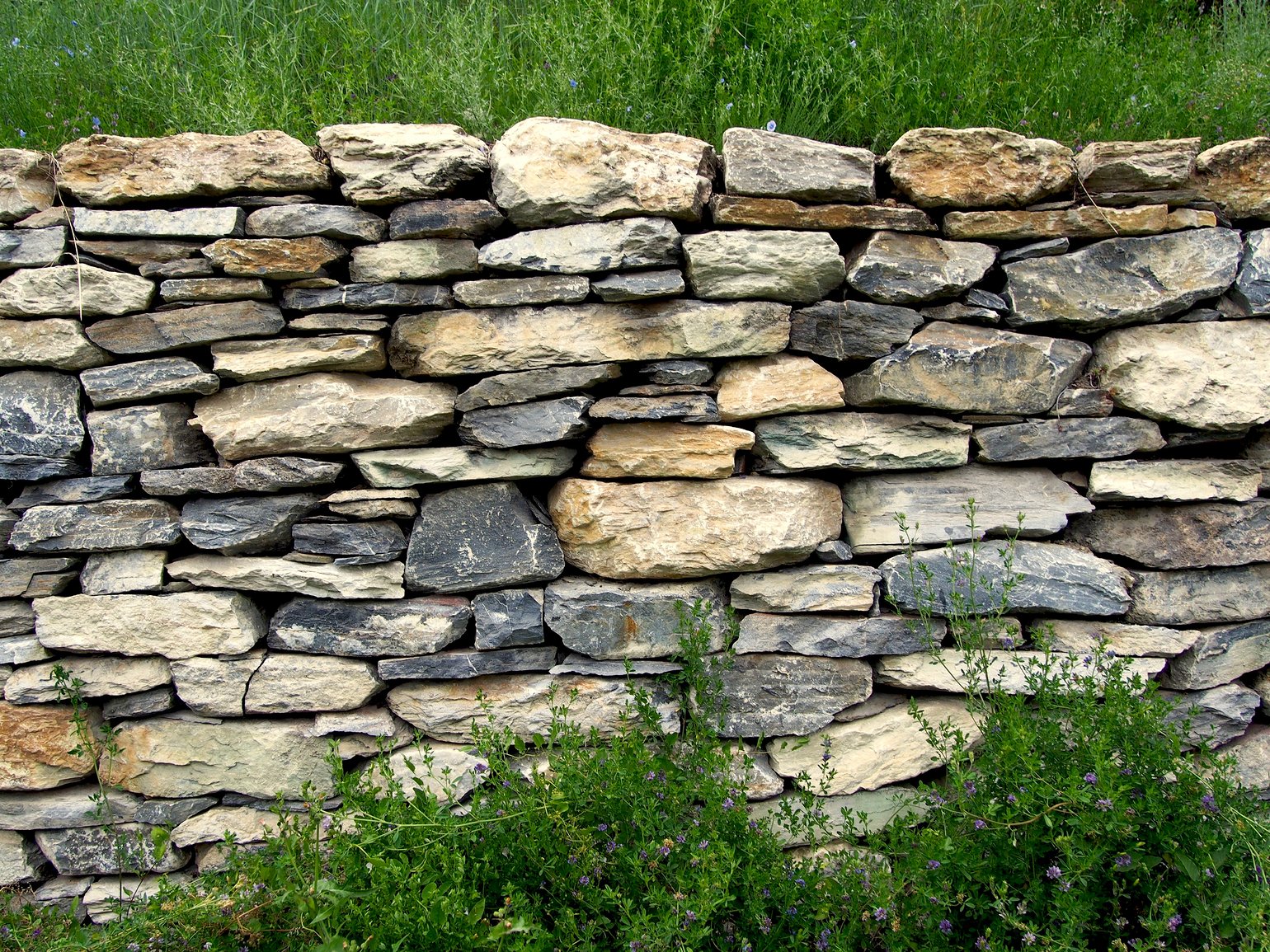
vera I choosed this point of view so to highlight the geometric design of the stone arrangement and colors. Do you think it will appear as well from diagonal or bottom-up perspective? I can be wrong and your comment is interesting. Thank you for it! I like to discuss!
jokele I think, your perspective works very well. But I would have taken it without the grass in the front and back. Just the stones. Like a pattern or structure.
jokele I like this walls as well :)
vera Yes! It was my idea, to make a sort of pattern. Thank you for your comment too!
vera Thanks!
Satoshi T I like contrast of green and stone over part. but a little bit messy under part... It is nice to separate sharply. like as your "A tree and a cloud...". :-)
vera Ok! Good idea! thank you Satoshi! :-)
Tomasz Dolata great, for me always the walls hide a story and mystery....


LaFoxes Nice idea and good light! but taken from the front it may result flat and not dynamic. I would try a diagonal or a bottom-up prospective :)