Day 311, July 11th, 2018
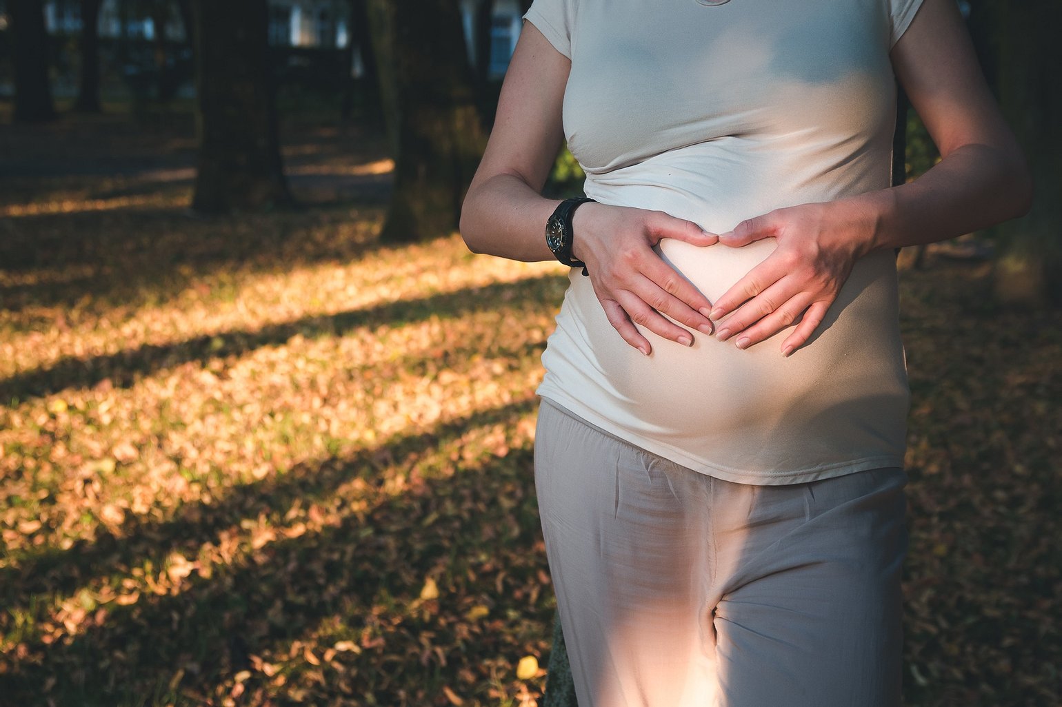
ponzu I like the crop that leaves out the face. It almost says that the baby is most important thing in the world, at least this future mother's world. I like the light and the color scheme. I might have taken the watch off, but then again, if I was the photographer, I probably would not have thought about until I was looking at the photo. I don't know about the dark spot on the breast. It almost looks like it's a patter on the shirt, but more likely it's a shadow exaggerated by processing. I think it looks distracting and, if not "ugly", then "unpretty". It doe snot go with the bright mood of the photo. I would try to lighten it in the editor.


Roman Czarny Fajnie światło brakuje jednego twarzy 😢